From the traditional can, to the microwaveable cup, to the pouch of soup, Campbell’s continues to set the bar in the world of packaging design.
Let’s take a look at how this brand has transformed its packaging from a traditional can, to a one-cup serving, to a soup pouch, all the while reinventing the rules of the soup game.
Campbell’s was founded in 1869; but, it wasn’t until 1895 that the first can of ready-to-eat soup was introduced to the world. Two years later, in 1897, the first can of condensed soup was introduced to the public.
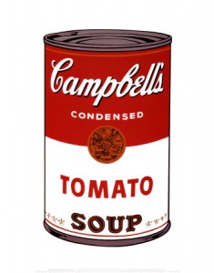 In this day and age, we can recognize the Campbell’s soup can from a mile away, because of the red and white label. But, it wasn’t until 1898, after an executive at the company attended an annual Cornell vs. Penn football game and became intrigued by the red and white uniforms of Cornell. So, he went back to Campbell’s and convinced them to use these brilliant colors on their soup labels. Did you ever wonder what the significance of the gold medallion is on each label? That gold medallion signifies the award for excellence that Campbell’s won at the Paris Exposition in 1900.
As time went on, the original label was updated again in 1999 for Campbell’s three top-selling soups- Chicken Noodle, Tomato and Cream of Mushroom. The packaging design was updated by moving the signature gold medallion to a more prominent position on the can. Additionally, the red on the colored band was intensified and photos of the soup were added. Other varieties of condensed soup also received the graphic adjustments as well.
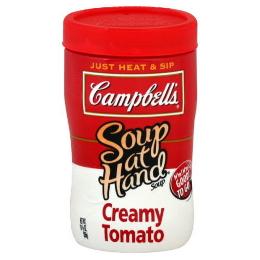
In 1998, Campbell’s created the microwavable cup and in 2002 the convenient on-the-go “Soup at Hand” was introduced to their product packaging repertoire.
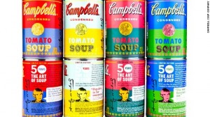
In 2012, Campbell’s released their limited-edition Warhol-inspired cans at Target. Andy Warhol, a very famous pop artist, painted his first Campbell’s soup cans in 1962.
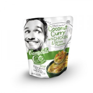
Also, in 2012, soup sales began to decrease; so, in order to find a solution to this problem, executives from Campbell’s hit the pavement to find what makes consumers, particularly young people, tick. And, through their travels, they came to the conclusion that cuisines that were once considered to be exotic, like Brazilian, Indian and Thai, were the norm and that younger consumers who dined out more often weren’t as skilled at making ethnic home-cooked meals. The solution was the innovative pouch of soup, otherwise known as “Campbell’s Go Soup” that comes in flavors like Coconut Curry, Golden Lentil and Creamy Red Pepper.
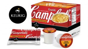
The company needed to revamp their brand after it was losing market share to private label brands and small competitors in 2013. In order to make the brand “cool” again, CEO Denise Morrison spent millions upon millions of dollars reinventing the company’s packaging and marketing, which included their to-go soup cups that were designed for the Keurig coffeemaker.
Although the packaging design continues to change, in order to keep up with the consumer’s needs and demands, Campbell’s has continued to grow their brand and their products to meet those needs. With 2014 underway, consumers will have to wait and see what Campbell’s will come up with next.
Copyright Davison 2014
Sources:
http://www.reuters.com/article/2013/10/30/us-campbell-turnaround-idUSBRE99T16820131030
http://www.forbes.com/pictures/lmj45ljli/campbells-switches-to-the-red-and-white-label/
http://www.huffingtonpost.com/2012/09/07/campbell-soup-reinvents_n_1864170.html
Images:
http://cdn.phillymag.com/wp-content/uploads/2012/09/campbells.jpeg
http://di3-1.shoppingshadow.com/pi/i.ebayimg.com/00/$T2eC16N,!)kE9s4Z-v!WBQrD4Ndjeg~~_32-260×260-0-0.JPG
http://shelleygeorge.files.wordpress.com/2010/05/campbell-soup.jpg