Last week, we wrote a blog about five examples of creative product packaging designs and how they stand out among competitors. So, we decided to focus this blog on brands, like Toblerone, EOS and Pringles, that stand out on the store shelves.
Let’s take a look at some creative and out-of-the-box packaging designs and how these products stand out among other brands!

Toblerone- The triangular-shape of Toblerone candy has a very distinct packaging design and has become a symbol of Switzerland and airport duty-free shops.
The unusual shape of this packaging design is very commonly mistaken to be inspired by the Swiss Alps, more specifically, the Matterhorn. However, the candy’s creator, Theodor Tobler, based the idea of his packaging design on the Folies Bergere in Paris, whose dancers ended their performances in a pyramid formation.
In 1908, the Tobler Company came up with the honey and almond nougat recipe and its unique shape, which was patented a year later. It’s rumored that the person who granted the Tobler’s the patent was Albert Einstein, who at the time worked at the Swiss patent office.

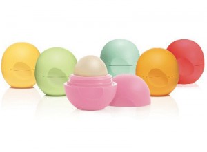
EOS- So there you are in your local drug store, searching high and low for the perfect lip balm; you see different tubes, some in little cardboard boxes and others perfectly lined up, waiting for you to pick one up. Nothing catches your eye, until you see a little egg-shaped container that instantly puts a smile on your face. That’s exactly what Evolution of Smooth, otherwise known as EOS, was working towards when they created their egg-shaped packaging design for their product. Also known as the “Smooth Sphere,” EOS wanted to create a unique packaging design that would make the consumer smile.

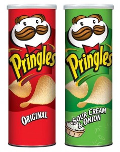
Pringles Can- You’ve probably heard it before, “Once you pop, the fun don’t stop;” although they are lacking in the grammar department, the Pringles brand is excelling in the chip aisle. Aside from their taste and variety of flavors, Pringles are primarily known for their packaging, the tubular paperboard can that is lined with foil and a plastic lid. This package design stands out among the countless brands that package their product in bags. Throughout the years, Pringles have turned to advertising campaigns that compared their product to conventional potato chips. For instance, they were once marketed as the “Newfangled Potato Chips” and had a small silver pop-top to open the can. Since the 1980s, those pop-top cans have been replaced with foil tops. The Pringles remained fresh and unbroken and the package design of the can holds as many chips as a bag. Their curvy shape allows them to be stackable, which was the inspiration of their slogan, “Other potato chips just don’t stack up.” Touché Pringles; we see what you did there.
The stand-out packaging design of the Pringles tube was invented by Fredric J. Baur, an organic chemist and food storage technician, who specialized in research and development and quality control for Cincinnati-based P & G.
From triangular-shaped chocolate, spherical lip balm and a can of potato chips, these are just a few of the creative and out-of-the-box packaging designs that stand out among other brands because of their unusual shapes and sizes!
Copyright Davison 2014
Sources:
http://www.dailyglow.com/eos-lip-balm-the-egg-and-the-mystery-exposed.html
http://en.wikipedia.org/wiki/Pringles#Marketing
http://www.marketingmagazine.co.uk/article/1141350/champions-design-toblerone
Images:
http://creativeroots.org/2009/06/toblerone-packaging/
http://www.essence.com/2012/04/06/miracle-worker-eos-organic-lip-balm-smooth-spheres/
http://www.bubblews.com/news/415838-pringles